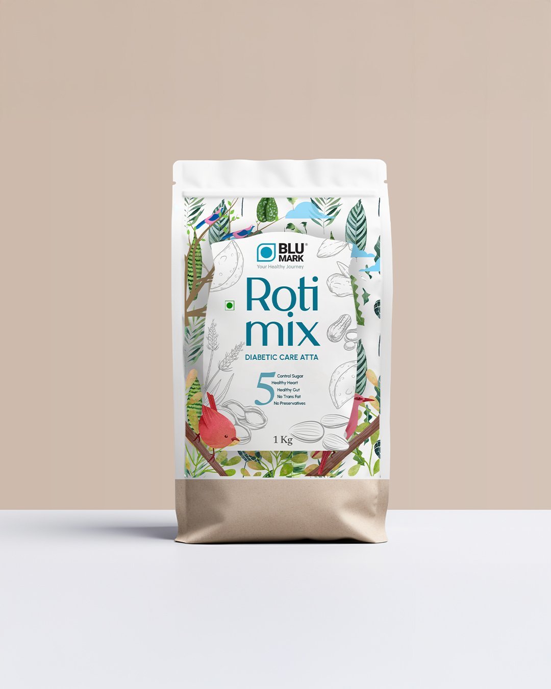
At Better Than Agency, we believe everyday products deserve extraordinary clarity. Our recent collaboration with Blu Mark brought that belief to life, reimagining a medicinal lifestyle staple, Sugar Control Atta, with packaging that tells a clear, honest story while fitting seamlessly into modern routines.
Why this mattered
The category is crowded with functional claims and traditional forms.
Consumers want healthier choices that feel intuitive, not intimidating.
The pack has to work as hard as the product, on shelf, online, and at home.
The core narrative: evolution you can see
We framed the design around a simple transformation: the journey from the classic grain sack to a contemporary, consumer-friendly pouch. This shift isn’t just aesthetic, it’s functional, ergonomic, and symbolic of progress. The packaging becomes a visual narrative: tradition you can trust, innovation you can use.
Design principles we followed
Form with purpose: The pouch format improves grip, storage, and resealability while creating stronger shelf presence and e-commerce readability.
Color with intention: A warm–cool palette balances approachability and clarity, warm tones cue familiarity and nourishment; cool accents signal control, health, and precision.
Type with character: We built a hybrid typography system that blends serif credibility with sans-serif modernity. This duality helps the brand feel both trustworthy and up-to-date.
Information at a glance: The front-of-pack hierarchy prioritizes what matters, “Sugar Control Atta” as the hero, clear benefits, and cues for usage and lifestyle fit. No noise, just guidance.
What changed, and why it works
From rustic to refined: The sack-to-pouch transition respects the category’s roots while meeting today’s expectations for convenience and hygiene.
From clutter to clarity: Simplified claims and structure reduce cognitive load, making healthy decisions faster and easier.
From generic to ownable: The hybrid font pairing and color system create distinct brand memory while staying legible across sizes and channels.
Motion-first storytelling
We launched with a two-part content approach:
A creative video that brings the new pouch to life, texture, movement, and the product’s story in motion.
A carousel breakdown that unpacks the design system: form, color, type, and information hierarchy. This gives both consumers and retail partners a transparent view into the thinking.
How this supports the business
Shelf impact: Clear hierarchy and a calm, confident color system improve recognition and findability.
Digital performance: Clean typography and contrast-tested colors are optimized for thumbnails and small screens.
Brand trust: Consistency across form, type, and tone builds credibility in a sensitive health-led category.
The Better Than Agency approach
Strategy first: We defined the narrative before we touched the layout, what should this pack make people think, feel, and do?
Modular systems: Colors, type, and information blocks are built to scale across SKUs, formats, and future line extensions.
Craft + practicality: Every design choice was tested against real-life use, storage, grip, opening, re-closing, and kitchen visibility.
What’s next
This system is built for growth, format variations, flavor extensions, and supporting communication (recipes, usage guides, and retail displays) can all build on the same design DNA. For Blu Mark, that means a cohesive visual language as the brand expands its health-forward portfolio.
Credits
A big thank you to the Blu Mark team and our collaborators who brought rigor and heart to every detail, from typography nuance to pouch structure and motion design.
If you’re a health, FMCG, or lifestyle brand looking to modernize without losing your roots, let’s talk. We help products tell clearer stories, on the shelf, in the hand, and in the mind.


