Branding becomes truly powerful when it aligns seamlessly with physical space. This was the core challenge and opportunity while working on the branding for Kohana, an affordable lab-grown diamond brand whose store interiors were already finalized before the brand identity was completed.
The interiors were inspired by a Japanese tea room concept, known for calmness, balance, and minimal elegance. However, the existing branding created by a previous agency did not match the interior vision, resulting in a disconnect between the space and the brand. The objective was to design a logo and brand guidelines that would naturally blend with the interiors while enhancing the overall retail experience.
The Branding Challenge: Aligning Identity With Interior Design
In retail, customers experience the brand visually and emotionally the moment they enter the store. When branding and interiors do not speak the same language, it impacts trust, perceived quality, and premium appeal.
Kohana required:
- A logo and brand identity aligned with a Japanese tea room inspired interior
- A feminine and luxurious look suitable for a lab-grown diamond brand
- Cultural inspiration that felt refined, not themed
- Brand guidelines that interior designers could easily apply across the store
The challenge was not just aesthetic. It was strategic.
Designing the Brand Alongside the Space
The branding process was carried out in close collaboration with the interior design team. Every design decision was made by evaluating how it would live within the physical environment of the store.
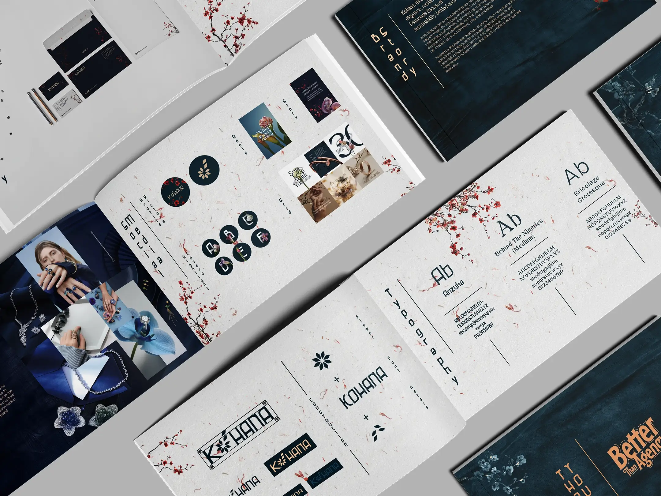
The name Kohana means “little flower” in Japanese. This meaning became the foundation of the visual identity.
Logo Design Concept
The logo was designed as a flower created using small diamond-inspired forms. The petals were drawn with a soft, flowing movement inspired by cherry blossom art in Japanese culture. The intention was to ensure the symbol looked like a flower first, rather than a diamond icon.
This approach helped the brand feel:
- Feminine and elegant
- Inspired by Japanese aesthetics without being literal
- Luxurious yet approachable
- Emotionally warm rather than sharp or clinical
Creating Luxury Through Minimalism
Japanese design philosophy values restraint and intention over excess. The brand guidelines were built around this principle.
Key elements of the brand system included:
- Balanced typography with Japanese-inspired alignment and spacing
- A warm, muted color palette that complemented natural interior materials
- Thoughtful use of white space to allow the interiors to breathe
- Clear visual rules that supported architecture rather than competing with it
The result was a brand identity that felt calm, premium, and cohesive inside the retail space.
Avoiding the Pan-Asian Branding Trap
One of the most important considerations was ensuring the brand did not resemble a pan-Asian restaurant or café. This was achieved by avoiding obvious cultural symbols and instead focusing on subtle artistic references.
The Japanese influence is present in the softness, alignment, and flow of the design rather than in overt visual cues. This made the brand feel globally refined rather than themed.
The Result: A Cohesive and Elevated Brand Experience
The final branding for Kohana successfully aligned with the Japanese tea room interior concept while maintaining its identity as a modern lab-grown diamond brand.
The outcome delivered:
- A logo that feels elegant, feminine, and culturally inspired
- Brand guidelines that enhance the interior design rather than clash with it
- A consistent and premium retail experience
- Stronger brand recall and emotional connection
Most importantly, the branding now feels like a natural extension of the space.
Why This Branding Approach Matters
Branding today goes beyond logos and packaging. It lives in physical spaces, environments, and experiences. Kohana’s identity demonstrates how thoughtful collaboration between branding and interior design can elevate a retail brand.
At Better Than Agency, branding is approached as a system that works across space, product, and perception. When branding belongs in the space it occupies, it creates trust, clarity, and lasting impact.